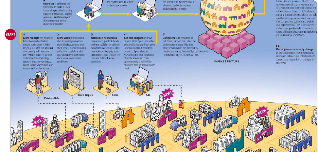
Learning how to make a visual explanation that sings will give you an important tool to advance your career. They help the storyteller clarify key points and help audiences grasp both the big picture and drill into detail. An effectively designed visual explanation will help audiences become engaged in the story, creating a vivid experience that helps them retain information easily.
What are the best communication tools for change? Here’s a detailed list.
But not all visual explanations are created equal. We’ve all puzzled over incomprehensible diagrams, spaghetti-esque process flows, and charts that convey absolutely nothing. Just because it’s visual, doesn’t mean it’s clear.
Here are four (and a half) rules all visual explanations need to follow:
1. Provide a clear point of view.
People tell stories for a reason. We want to convey a particular piece of information, convince a reader, or share an emotion. Knowing what you want to impart to your audience can help you filter out unimportant details. For instance, if you’re creating a visual explanation of a new, integrated, and automated supply chain, you might want to depict marketing and finance but probably don’t need to show human resources.
Insider tip: When creating a Foglifter for a new process, clients often ask me if we should do a “before-and-after” visual or just show the new-and-improved process. Each project is different, but generally, if the audience is already familiar with the process, showing the current state is a waste of time. If the audience isn’t familiar, you’re distracting them with non-critical information. In either case, let the reader know why the old process needed to change or what problems the new process is solving, and move on.
2. Don’t give too much or too little.
Audiences can only take in so much at once. When working with tools that let you expand your story infinitely, such as web pages or PowerPoint, it’s easy to forget that more is not more. This can be especially true in collaborative or team storytelling settings. So, you must think about your audience’s appetite for the story and give them just the right amount of content. Too much and you’ll bore them; too little and you’ll leave them baffled or with more questions than when they started. This is particularly tricky when you’re creating a visual story for multiple audiences, both expert and novice.
Insider tip: To make your visual explanation easier to read, use typography, call-out boxes, and sidebar content to create a second voice for content that not all readers need. You can use this second voice to give experts a deeper dive or provide novices with some extra background material (but not both, see Be consistent below). Separating the content out in this way lets readers know it’s okay to skip certain chunks of information.
3. Be consistent.
One of the hardest parts about visual explanations is being consistent. Once you’ve assigned meaning to an image, an icon, a color, etc.—you can’t change it! The temptation to reuse elements but slightly change their meaning or intent is very high, but no key will ever help the audience decipher a mid-story switch. Color-coding is one of the hardest elements to use. As one of my colleagues is fond of telling me, it’s difficult to use more than 12 colors in a color-coding system. So unless you’re sure that whatever you’re coding doesn’t have more than 12 items, try to find another way to differentiate.
Insider tip: I had a professor who admonished our class over and over again, saying “no one reads the notes.” Don’t rely on a key or legend to help the audience understand your icons. If your icon or image doesn’t convey the message and you can’t add a simple label, you need to re-design it.
4. Make it easy to navigate.
English readers often expect to a story to flow left to right, top to bottom. But as a visual storyteller, you don’t have to be constrained by that. You can have audiences start in the middle of the page if you like, as long as you make it clear. Arrows, numbers, typography and “start here” flags, are all good ways to help audiences navigate a visual story and ensure that they don’t miss anything. Even if your story is non-linear, many audiences find a flow reassuring. So give the audience clues about where to start and help them along as they go through your story.
Insider tip: A lot of clients are concerned that numbering parts of the story imply a priority or sequence that they don’t intend. While that can be true, numbering ideas or elements make discussing and referencing parts of a story much easier. You have to weigh the pros and cons, but I’m always a fan of numbering.
41/2. Add a little humor
Humor can be tricky—too much and your visual explanation can come across as unpolished and unprofessional. But just a little in the right place can make your story really sing. Avoid gimmicky humor or complex pop-culture themes and instead shoot for one or two small injections in inauspicious places.
Insider tip: Let the image tell the joke and keep the text as a “straight-man” voice. A whimsical example with a serious explanation provides a winning combination of interest and professionalism.
So whether you’re working with a designer or just drawing boxes on a whiteboard, apply these rules to make a visual explanation that works for you.
Keep going: Want to create clear and engaging instructions? Be a better host.

