Innovators love having big ideas: grand flashes of brilliance that will revolutionize things like how the company works, the consumer experience, or new technology. But the idea is only half (or maybe even less) of the battle. The real struggle is in bring the idea to life. Putting time into smartly designing a project report that works is essential to gaining stakeholder buy-in.
Read: The Importance of Early Buy-In for Strategic Planning
In companies large and small, the process of taking an idea and developing it into a real thing—product, service, process, technology—takes time. And time means oversight. And oversight means project reports.
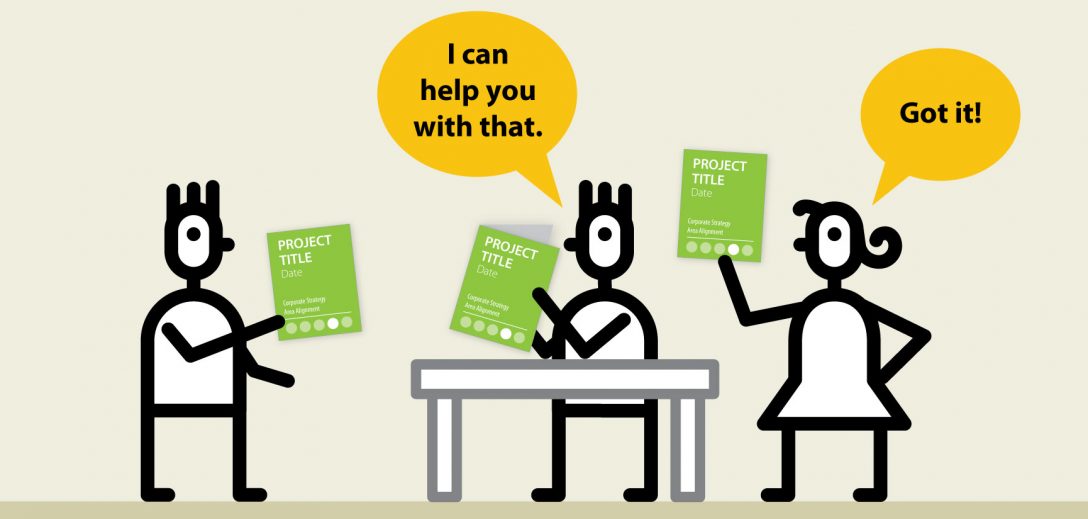
A necessary evil of corporate life, designing a project report is the bane of many innovators’ existence. They are hard to compile, taking valuable time and resources away from doing real work. They often are shown to executives who have no real sense of the idea or what the idea is trying to accomplish. And those gaps in understanding raise irrelevant questions or issues that take up more time. Plus, those gaps introduce an additional element of risk into a project: fail to show progress in the right way or catch the wrong person’s eye and your fledgling idea could find itself back on the shelf, with no funding or support.
So, if project reports are so awful, why not just get rid of them? The obvious answer is they provide accountability and governance into how resources are being spent. But they can also be innovators’ and project leaders’ best friends. They help innovators tell exciting stories about the work they are doing, gaining guidance, insights, and opportunities along they way. They can help project leaders tap into a vast network of knowledge and expertise across a company. And they can help teams to re-affirm their own goals and maybe have a few “a-ha moments” along the way.
But all of these great things can only happen if the reports contain the right information and are presented in the right way. The key to designing a project report that works for you is to make them scanable, comparable, and maintainable.
Scanable
Too often project reports are a dense mass of slides, copy and pasted from other presentations, project documentation, and even emails. All of those charts, millions of bullet points, and complex flow charts are impossible for leaders and executives to make heads or tails of. Instead of trying to bury leaders in an avalanche of paperwork to dissuade them from asking questions, try giving them a format that is scanable and reminds them of the project context, what’s happened so far, and what’s next to solve. Use section heads and information chunking to make it digestible. Try bolding keywords and phrases in each bullet point to help them jump out. Icons and infographics can also make a report easier to understand—but be careful not to rely on tired or clichéd visual metaphors (i.e. a thermometer progress bar or a stoplight clipart) that don’t provide any real information.
Comparable
A project report unto itself is useful enough, but the real value comes in comparing one project to another or a project to itself over time. When projects can be compared to each other, executives can see opportunities to share information and resources and avoid duplicate efforts. And comparing a project to itself over time helps executives to push along a stalled project or see an approach morph as new factors come into play. So, its important to design a project report that makes projects comparable. And, to think about what information is useful to compare—for instance which projects have the same goals, are focused on developing the same capabilities, or impact the same parts of the organization.
Maintainable
And finally, to be really useful, project reports must be maintainable. This means keeping them short and simple. Of course, there may be key metrics and figures that you need to pull, but in general, a project report should be able to be written in less than an hour by one or two team members. Depending on the frequency of the report, the length and complexity may vary. But for a quarterly report, try to keep it to no more than 8 pages (16 slides).
How to: Designing a project report that works
Here is a page plan and outline for a quarterly report.
*Note: this is laid out for a printed 8.5” x 11” report. If you prefer to use slides, divide each paragraph or sub section into its own slide.
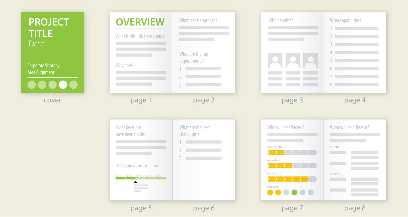
Cover
Make sure the project name and report date is clear. If this isn’t the first report for the project, you can indicate how many have come before i.e. Project ABC, Edition 4, April 1, 2017. If you have corporate strategies or goals, the cover might be a nice place to let people know where this project aligns.
It’s great to make reports easily distinguishable from other projects by assigning them a unique indicator on the cover—a lot of designers like color for this. But be wary: most people can only distinguish about 12 colors, and most companies have way more projects than that. So you may also need an additional element, like a shape, to create enough variations. Thus Project ABC is a red triangle, Project DEF is a red diamond, and Project XYZ is a purple circle.
Pages 1 and 2
At the beginning of your report, give your audience the gist of the project. This information probably won’t need to update often, if at all, during the course of the project. But it will helps give folks who aren’t involved in the project the context. Help everyone understand why this project is worthy of the investment being made, and stave off those eye-rolling “Why are we even doing this?” comments at the same time. On these pages, try to directly answer questions like: “What is the initiative about?”, “Why now?”, “What is our approach?”, and “What are the top requirements?”
Page 3 and 4
Now that everyone understands why this project matters, help them dive a little deeper into the details, specifically who and how. If you have developed personas, now is a great time to include small thumbnails. If not, just describe the user or target audience for your idea. And describe the capabilities your team is developing to reach your goal. For instance, if you are revolutionizing your sales system, capabilities might include improv acting training for the sales team, a new CRM, and a process for sharing best practices on an internal web site.
Page 5 and 6
So, now that everyone remembers why you’re doing the project and what the goals are, it’s time to tell them where you are. But don’t just throw up a timeline and a budget spreadsheet. Instead, remind your audience about key decisions that have already been made, like building capabilities internally instead of using a vendor. And give them a milestone list and timeline that includes both past events and key upcoming stage gates. Finally, be brave, and let the executive team know where you are struggling. Can’t find a vendor who can make the product to your exact specifications at the right cost? Having trouble integrating two legacy platforms? Be honest about your challenges and ask for help. And whatever you do—don’t call them opportunities.
Page 7 and 8
At the end of the report, it’s great to remind your audience that some day this project will end and the company will realize the benefit. So help them to see how those changes will manifest. Who inside and outside the organization will be most impacted and what will be different for them?
To modify this structure for a weekly or monthly report, just focus in on pages 5 and 6, but include 1-2 high level points from pages 1 and 2 and a brief statement about the capabilities being built.
Most innovators think that putting time into designing a project report with purpose is a waste of time. But, if you create them to help create context and push meaningful decisions forward, you’ll not only want to share them with executives and your governance teams, but with your peers too. You’ll want everyone in the organization to see your project at a glance and offer insights and assistance at the right time and place.
Next up: “Creating presentations to get permission from leadership”